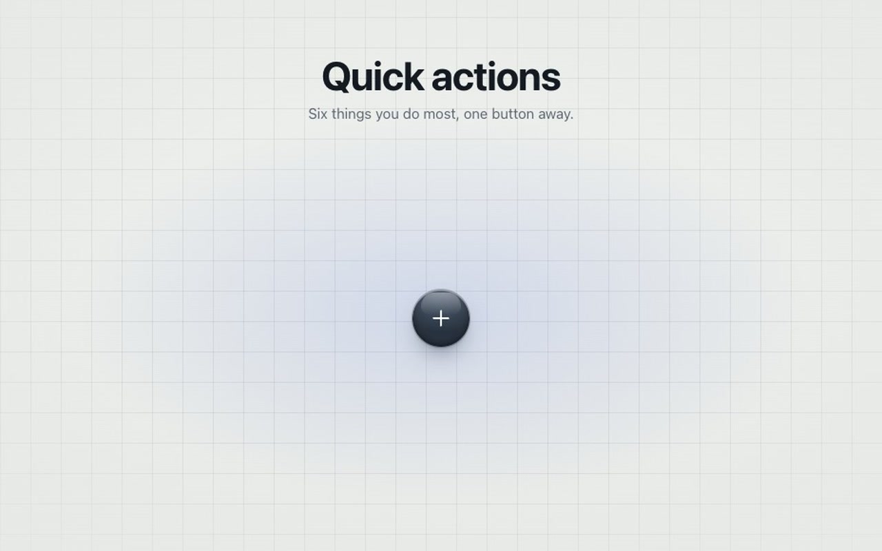
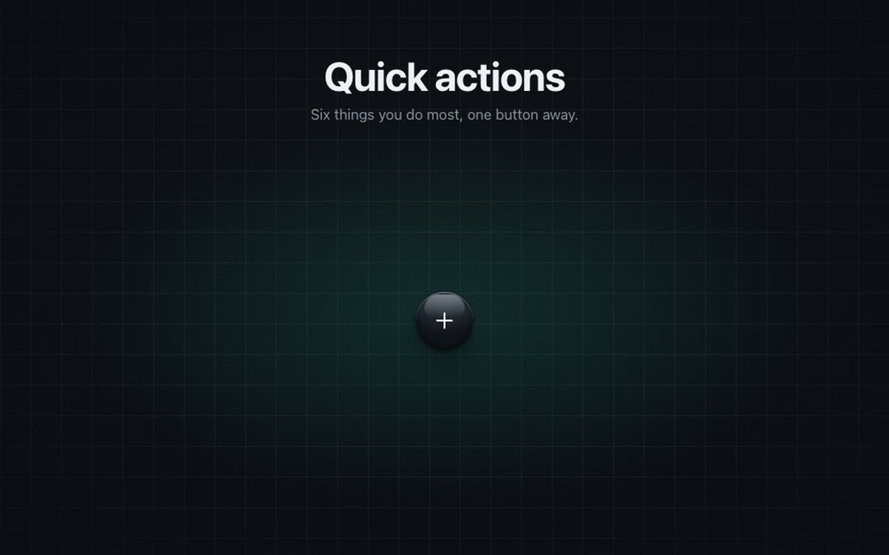
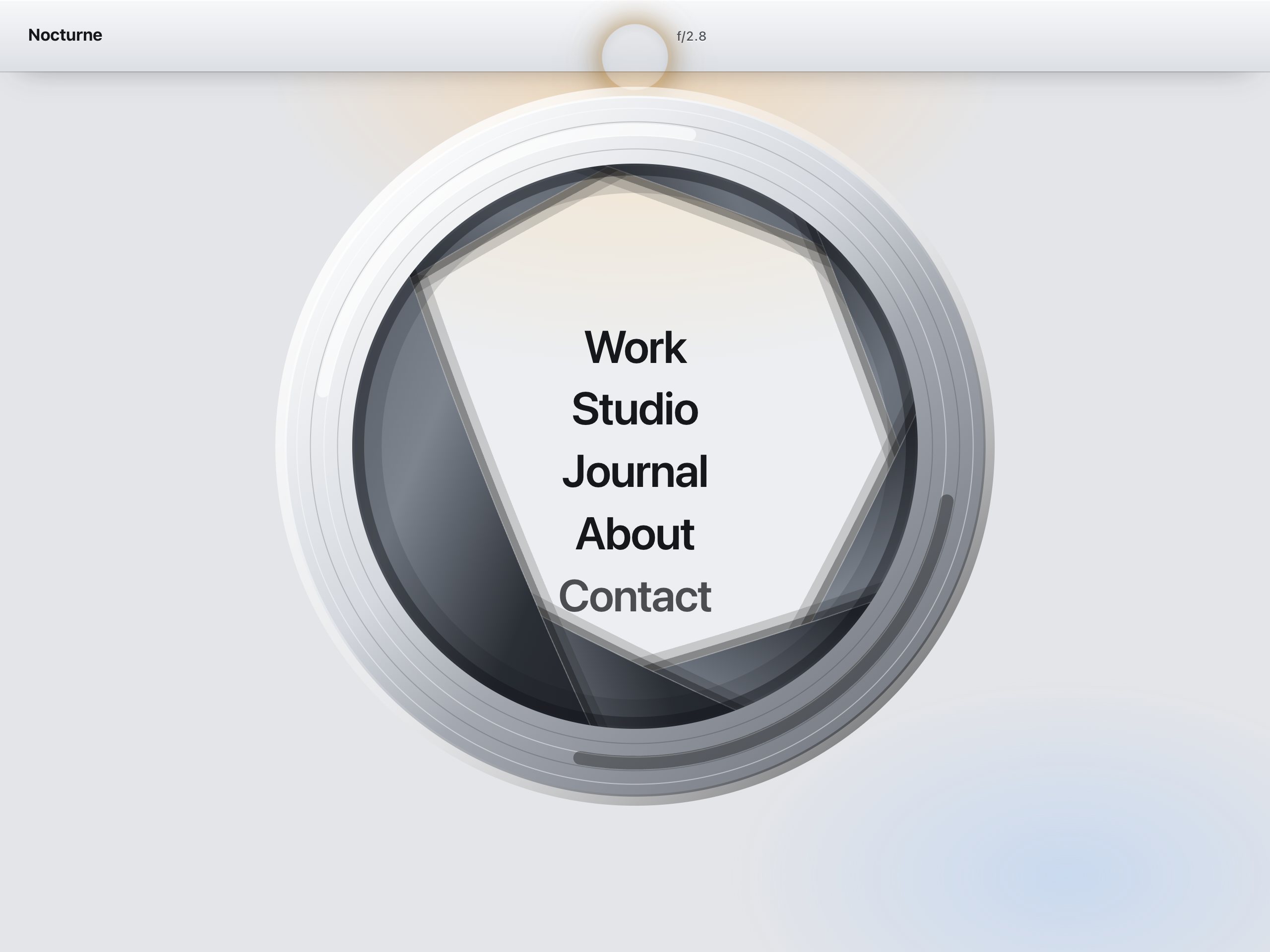
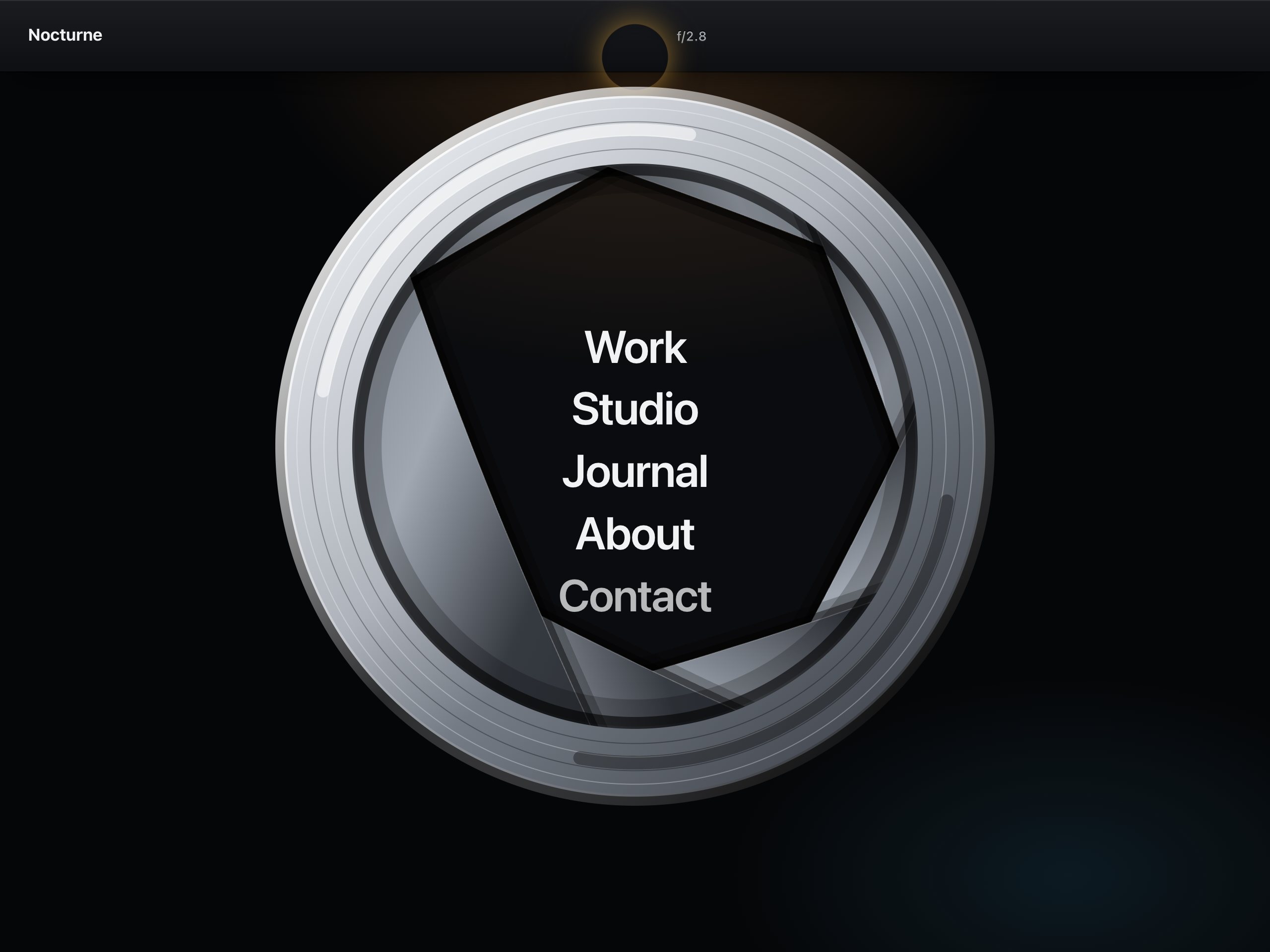
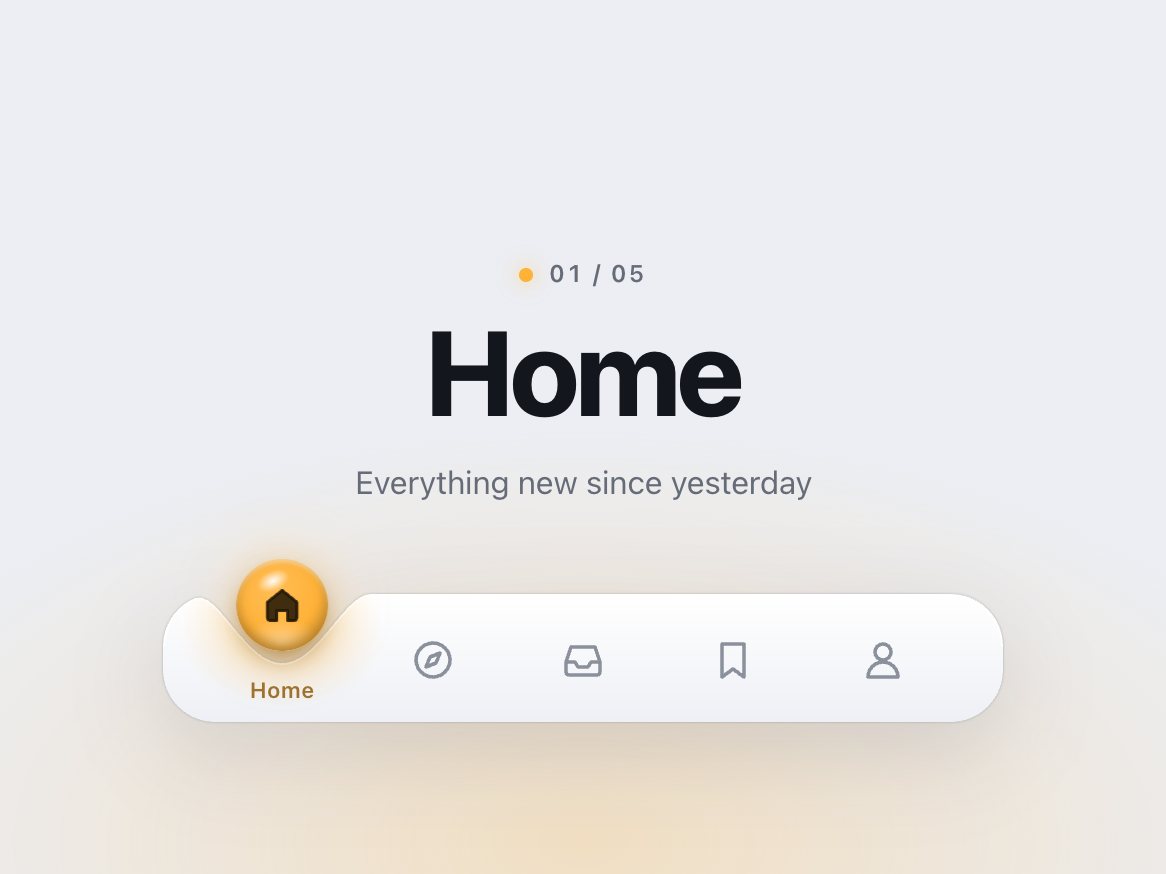
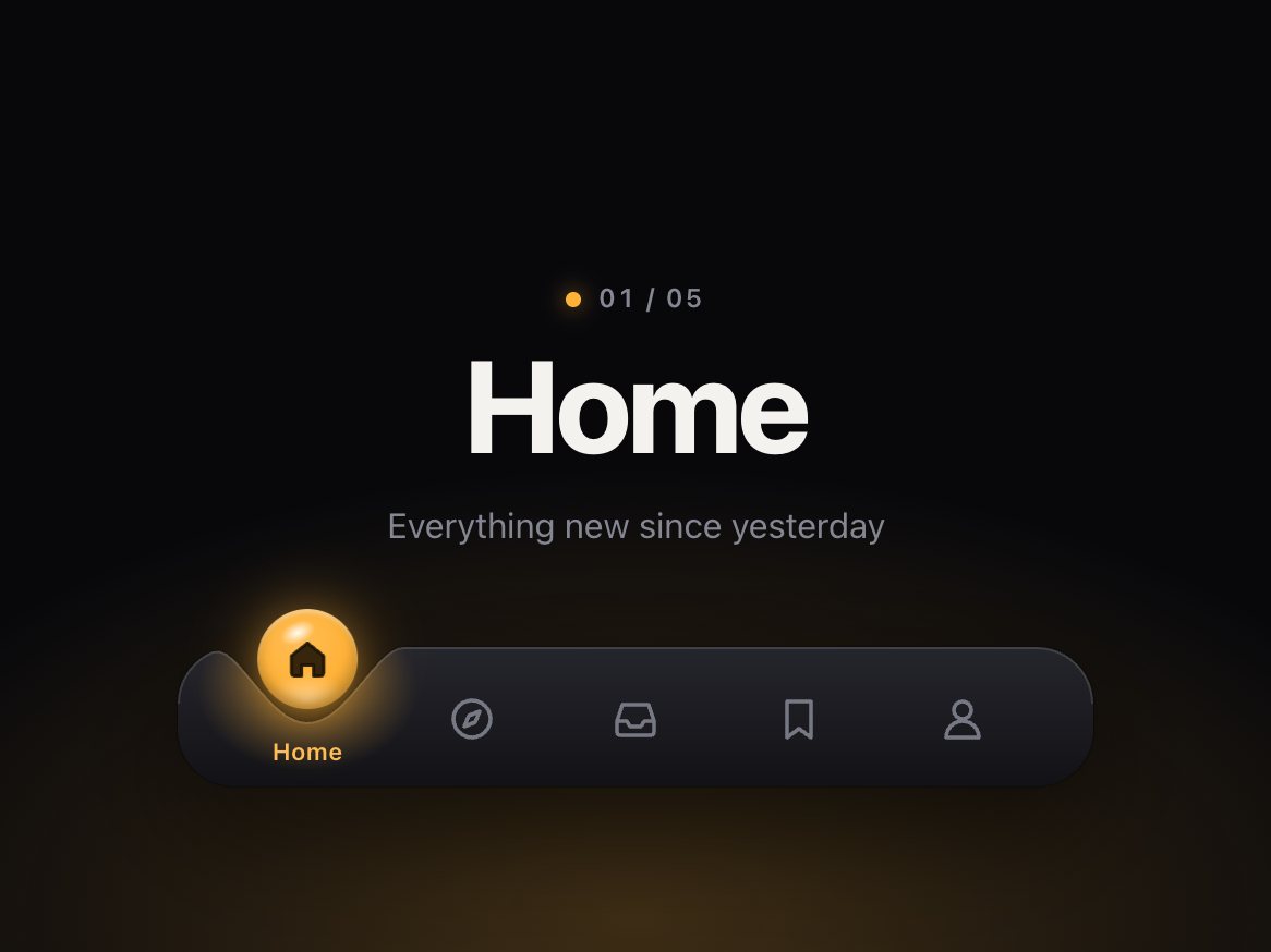
A floating action button that opens six actions on a ring, radar style. Press it and a smoked glass disc with range rings, tick marks and a cross-hair grows under the button while an arm with a bright leading edge sweeps once round. Each action pops on with a blip and a spreading ring at the exact moment the arm passes it. When the arm comes home it fades out and leaves an afterglow, and the reticle round the button pulses once. Hover or focus an action and the ring lights up at its radius with a label pill beside it. Close it and the arm sweeps back the other way, winking the actions out in its wake. Pick one and it flashes while the rest wink out and the disc collapses. It is also a marking menu: hold the button, or press and drag, and the arm follows your pointer round the ring; let go on an action to choose it, or flick from the closed button to open and pick in one move.
Good for
Quick-action buttons in dashboards, note and photo apps, map and monitoring screens, anything that wants a bit of mission control.
How it works
The sweep runs on the Web Animations API and its progress is read every frame, so each action lights when the arm's angle reaches its own, not on a fixed delay. While you drag, the arm follows the pointer's angle 1:1; the action it points at lights its range ring, shows its label and leans toward the pointer. On release the pointer's speed over the last 80 ms projects where the gesture was going, and the nearest action is chosen; a press that moves less than 6 px is a plain tap. The disc, rings and arm are plain CSS gradients; the blips and rings are tiny spans animated with the Web Animations API. Opening and closing can interrupt each other mid-sweep and continue from where the arm is.
How to use
Copy two files, paste the markup, call init() with your onSelect(index, value). Add or remove items and they space themselves round the ring.
Add the markup from index.html (the block between the COMPONENT comments). One .sweep-seat per action, any number: the script spaces them evenly round the ring. Give each item an aria-label (it is also the text of the label pill) and a data-value.
Press the button and the glass disc grows under it while an arm sweeps once round the ring. Each action pops on with a blip and a spreading ring the moment the arm passes it. When the arm comes home it fades out, leaves an afterglow, and the reticle round the button pulses once. Close it and the arm sweeps back the other way; the actions wink out in its wake. Choose an action and it flashes while the rest wink out and the disc collapses.
The full source, an example page and a README. No account, no framework.
Can I use it in client projects?
Yes, in unlimited projects. You can't resell or share the source itself.
Do I need React?
No. The README shows how to use it in React or Next.js.
Can I change the actions?
Yes. Each action is a button with its own inline SVG icon, aria-label and data-value. Six are in the example; four or eight work the same, spaced evenly.
Is it keyboard accessible?
Yes. It is a real menu button and menu: arrows go round the ring, Home and End jump to the ends, typing a letter jumps to an action, Esc closes and focus returns to the button.
Does it work on phones?
Yes. The ring shrinks so the whole disc fits at 320 px, the label pill moves under the ring, taps work the same as clicks, and press-and-drag works with a finger without scrolling the page.
Can I turn the drag off?
Yes, drag: false. Clicks and the keyboard work the same either way.
Can I change the colour?
Yes. One variable sets the arm, blips, lit ring and focus rings; the disc, button, action discs and label pill each have their own.
Light and dark?
Both are designed: paper with a slate disc and a navy arm by day, charcoal with smoked glass and a teal arm by night.
What about reduced motion?
No sweep: the actions fade in together, and fade out on close. Dragging still works, with highlights that crossfade instead of moving.
What if it doesn't work for me?
If it doesn't work like the demo, you get a refund within 14 days.
Still have a question? Email us. The person who made it answers.
exportfunctioninit(root, {
pages = 9,
page = 1,
window: win = 7, // beads shown at once when there are more than 12 pages (odd numbers work best)
onChange,
onPreview, // called while a bead is pulled, with the page it would land on
drag = true, // pull beads along the rod with a finger or the mouse
duration = 440, // ms a bead takes to cross the gap and settle
stagger = 40, // ms between beads in a chain
labels = {},
} = {}) {
.dimple {
--dimple-h: 64px; /* the bar itself */--dimple-head: 30px; /* room above the bar for the drop to hop */--dimple-drop: 46px; /* drop diameter */--dimple-radius: 26px; /* bar corners */--dimple-width: 420px;
--dimple-font: -apple-system, "SF Pro Text", "Inter", system-ui, "Segoe UI", sans-serif;
--dimple-bar-top: #ffffff;
--dimple-bar-bottom: #eef0f5;
--dimple-rim: rgb(255255255 / .95);
exportfunctioninit(root, {
onChange, // (index, href) => void, when the chosen link changes
onPreview, // (index, href) => void, while dragging: the link the beam is over
followLinks = true, // a plain click follows the link once the lamp strikes on it
drag = true, // press and drag (or flick) along the bar to aim the lamp
travel = 560, // ms, sets the spring's stiffness: with the default settle the beam is within 10% of// the link after ~0.35 s, strikes at ~0.33–0.4 s and is fully still after ~0.9–1.2 s
settle = .12, // 0–.4, how much the lamp overshoots and settles on arrival
} = {}) {
const $ = s => root.querySelector(s);
const head = $('.fresnel-head');