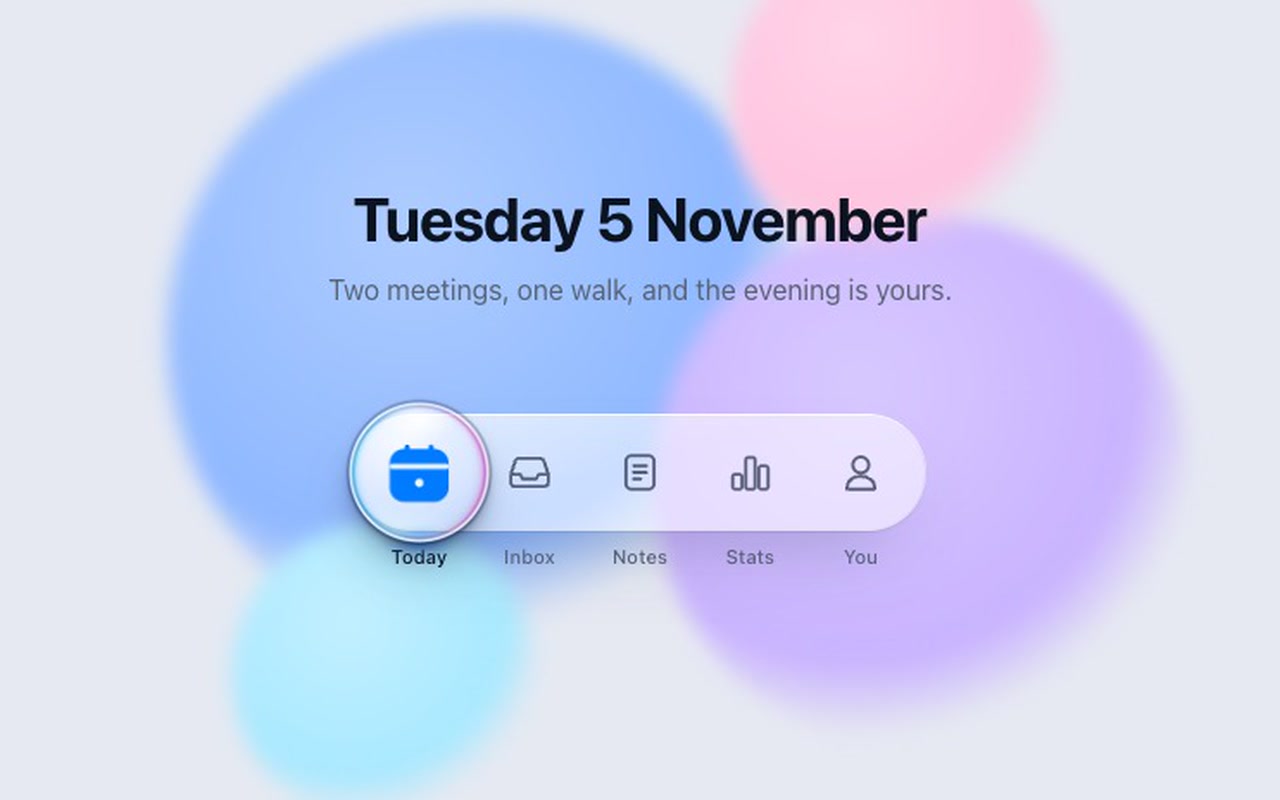
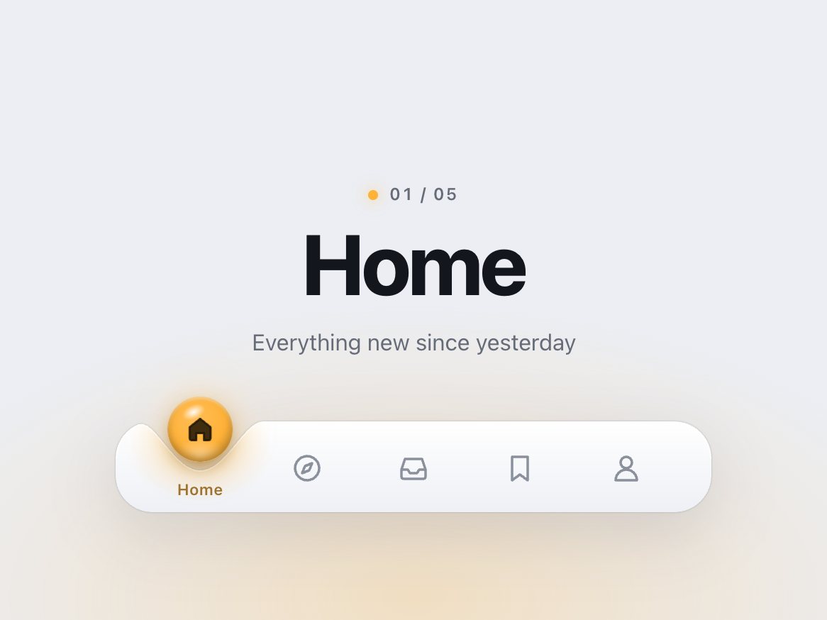
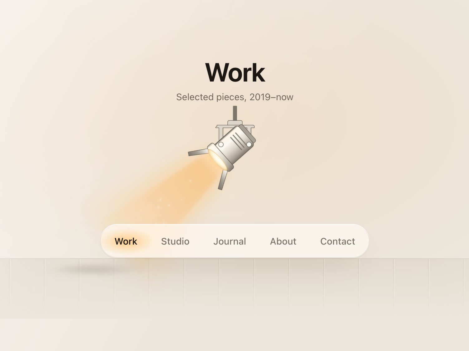
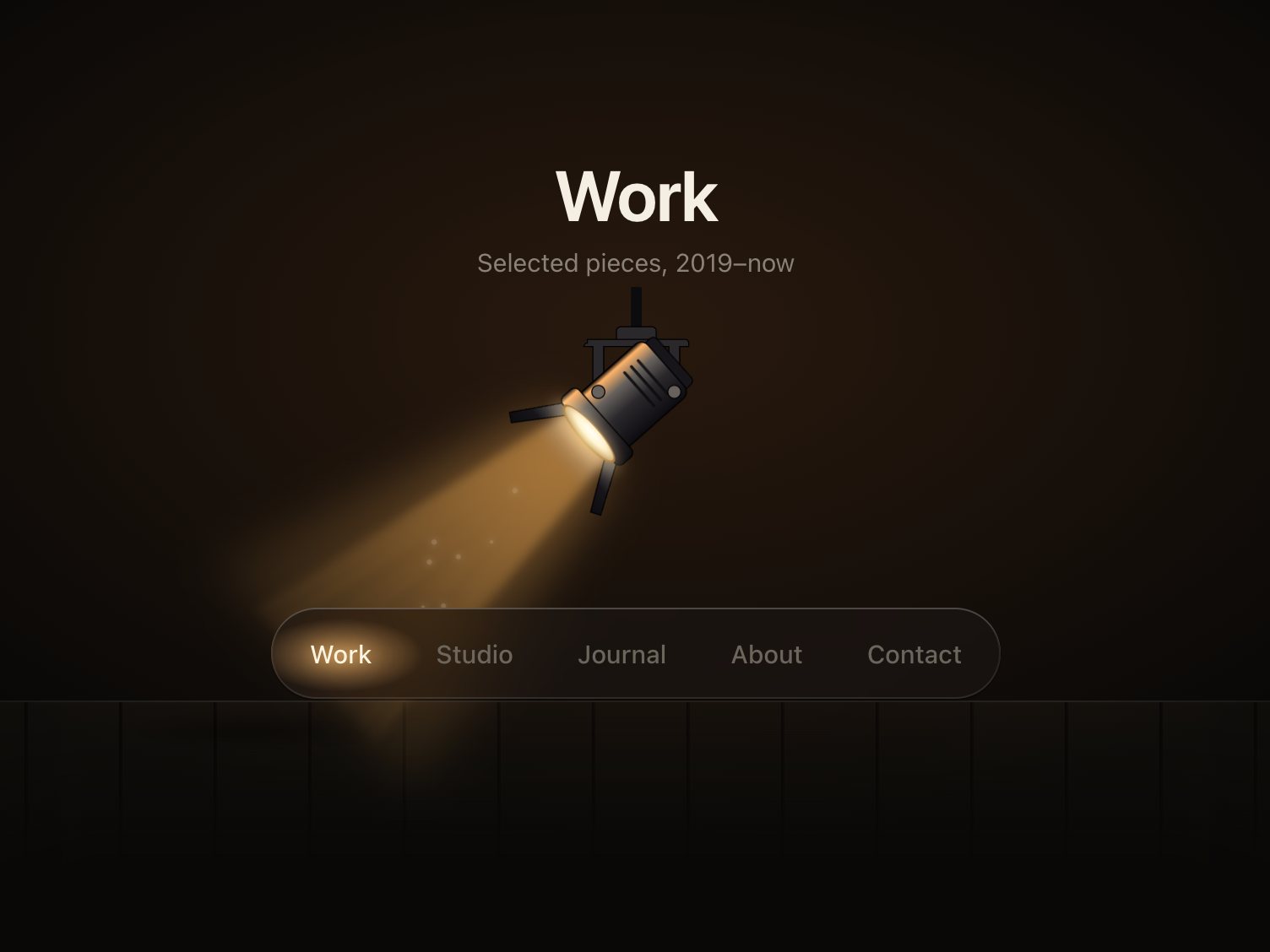
A five-tab app bar in frosted glass with a domed lens riding on top of it. The lens really magnifies: inside it is a copy of the tab row, scaled 1.6× and moved every frame so whatever sits under the lens centre lands in the middle of the dome. Tap another tab and the lens glides there on a spring, flattening slightly in the direction it moves while the icons scroll through it at 1.6× speed. On arrival the icon under the lens goes from outline to filled in the accent colour, its label turns to ink, a glint sweeps across the dome and a small spot of light appears on the bar beneath the lens. The lens itself has a bright top glint, a dark refraction ring with a cyan fringe on one side and magenta on the other, and a soft shadow on the bar.
Good for
App-style web UIs, dashboards, mobile web apps, portfolio and product sites that want an iOS-like bottom bar.
How it works
Tap a tab, drag the lens, swipe the bar, or use the arrow keys. While you drag, the lens follows your finger 1:1 and the magnification, squash and tab highlight update every frame; past the ends it resists and springs back. On release it keeps your speed, projects it forward and settles on the nearest tab, so a throw goes further. A quick flick anywhere on the bar moves one tab. The lens is a spring, so you can grab it or redirect it mid-travel without a jump. The icon under the lens fades out as the lens covers it, so only the magnified copy shows.
How to use
Copy two files, paste the markup, call init(). It fires onChange once with the index and value of the selected tab, and onPreview while the lens is dragged over tabs. Swap in your own icons on a 24px grid: silhouette paths fill on selection, detail lines become cut-outs.
Add the markup from index.html (the block between the COMPONENT comments). Five tabs are in the example; three to six work the same. Each tab is a <button> with an inline SVG icon and a label.
Mark the starting tab with aria-selected="true". Each tab's data-value is passed to onChange. The script builds the lens itself: a domed glass disc holding a hidden copy of the tab row, scaled up and moved every frame so the point under the lens centre lands on the lens centre.
### Your own icons
Draw them on a 24px grid, stroke 1.75, round caps. Give the silhouette paths class="loupe-shape" (they fill with the accent when the tab is active) and any inner detail lines class="loupe-line" (they turn into cut-outs on the filled shape). A path with no class keeps its stroke in both states.
The full source, an example page and a README. No account, no framework.
Can I use it in client projects?
Yes, in unlimited projects. You can't resell or share the source itself.
Does it really magnify, or is it just a bigger icon?
It magnifies. A hidden copy of the whole tab row sits inside the lens, scaled and repositioned every frame, so while the lens travels you see the neighbouring icons pass through it enlarged.
Can I use my own icons?
Yes. Inline SVG on a 24px grid. Give the silhouette class="loupe-shape" and inner lines class="loupe-line"; the README shows the pattern.
Is it keyboard accessible?
Yes. It is a tablist: Tab to the selected tab, then Left, Right, Home and End. The focus ring is drawn around the lens.
Light and dark?
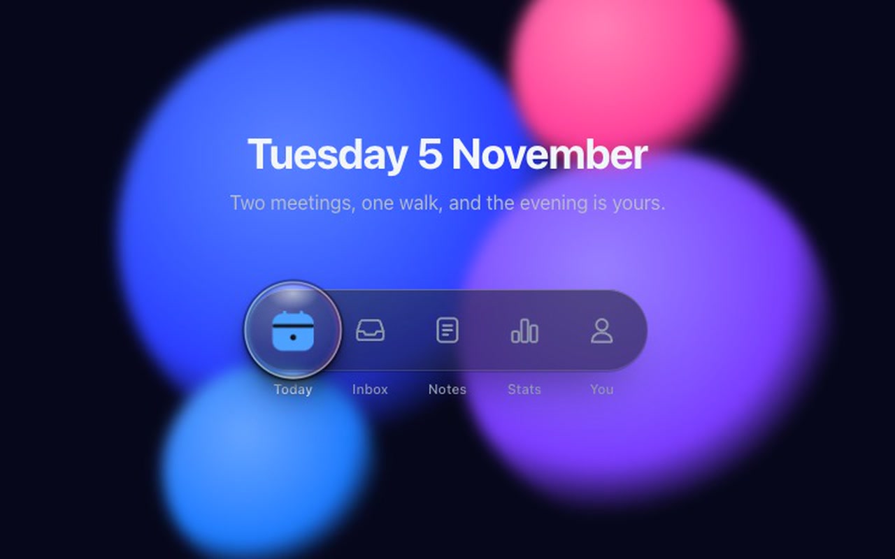
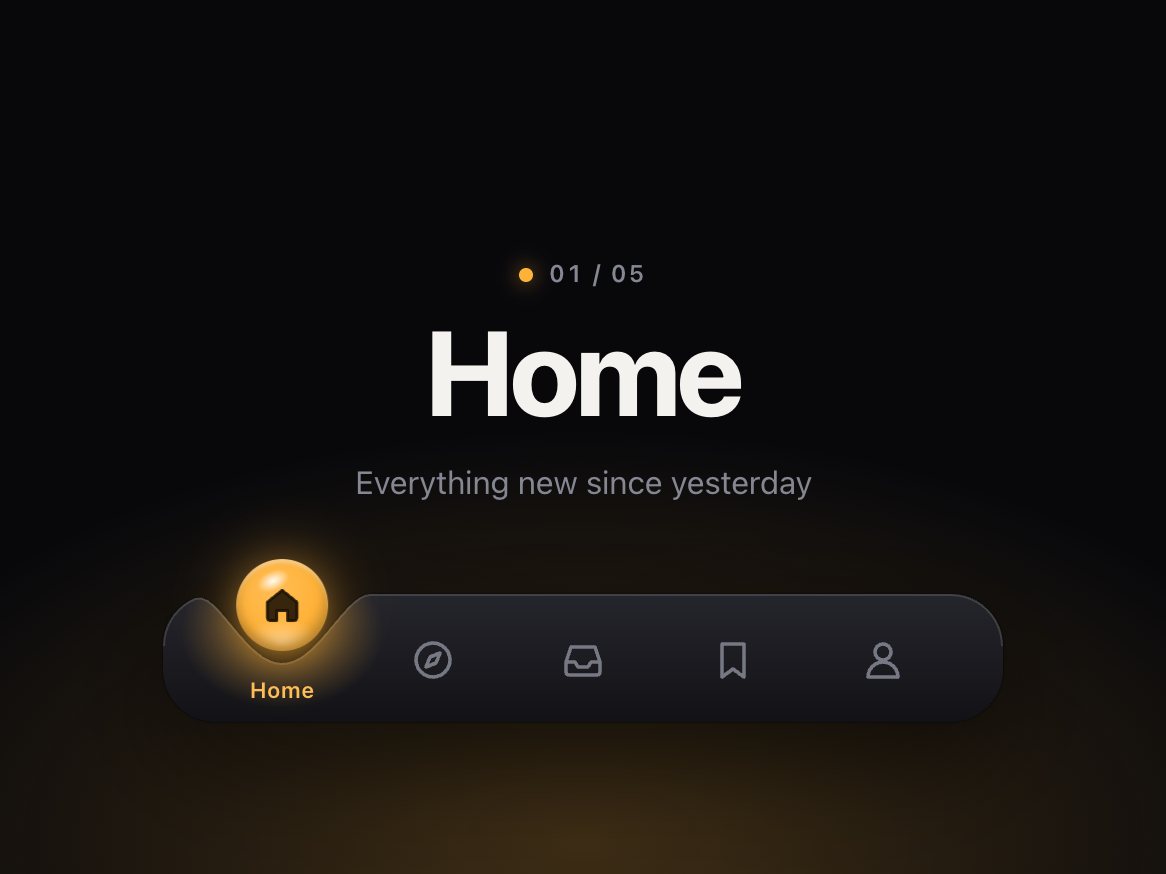
Both are designed: white frosted glass with a clear dome in daylight, smoked glass with a darker marble at night. With no theme set it follows the system setting.
Reduced motion?
The lens crossfades to the new tab instead of travelling, and the icon still fills. A dragged lens still follows your finger, without squash or rubber-band. With reduced transparency the glass turns solid.
Does it work on phones?
Yes. Under 420px the bar spans the width, labels hide and the lens shrinks to 1.3× the tab height. It responds on touch-down, you can drag the lens or swipe the bar with a finger, and vertical swipes over the bar still scroll the page.
exportfunctioninit(root, {
pages = 9,
page = 1,
window: win = 7, // beads shown at once when there are more than 12 pages (odd numbers work best)
onChange,
onPreview, // called while a bead is pulled, with the page it would land on
drag = true, // pull beads along the rod with a finger or the mouse
duration = 440, // ms a bead takes to cross the gap and settle
stagger = 40, // ms between beads in a chain
labels = {},
} = {}) {
.dimple {
--dimple-h: 64px; /* the bar itself */--dimple-head: 30px; /* room above the bar for the drop to hop */--dimple-drop: 46px; /* drop diameter */--dimple-radius: 26px; /* bar corners */--dimple-width: 420px;
--dimple-font: -apple-system, "SF Pro Text", "Inter", system-ui, "Segoe UI", sans-serif;
--dimple-bar-top: #ffffff;
--dimple-bar-bottom: #eef0f5;
--dimple-rim: rgb(255255255 / .95);
exportfunctioninit(root, {
onChange, // (index, href) => void, when the chosen link changes
onPreview, // (index, href) => void, while dragging: the link the beam is over
followLinks = true, // a plain click follows the link once the lamp strikes on it
drag = true, // press and drag (or flick) along the bar to aim the lamp
travel = 560, // ms, sets the spring's stiffness: with the default settle the beam is within 10% of// the link after ~0.35 s, strikes at ~0.33–0.4 s and is fully still after ~0.9–1.2 s
settle = .12, // 0–.4, how much the lamp overshoots and settles on arrival
} = {}) {
const $ = s => root.querySelector(s);
const head = $('.fresnel-head');