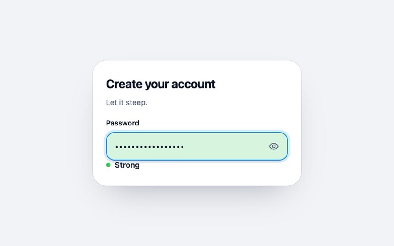
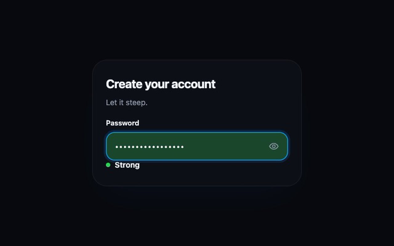
A password input whose background fills from the bottom with a gently moving liquid. The colour changes from red to orange to yellow to green as the password gets stronger. A strong password fills it to the top.
As you type, each password gets a score from 1 to 4. The liquid rises to that level with a slosh, and a short hint tells you what would make it stronger.
How to use
Copy two files, paste the markup, call initAll(). You can plug in your own scorer, such as zxcvbn.
Specs
Price
$5, one payment
Version
1.0.0
Code size
2.8 KB gzipped
Dependencies
None
Built with
HTML, CSS, JavaScript
Category
Form
Licence
Unlimited personal and client projects
In the zip
steep.csssteep.jsthe component and a built-in scorer
index.htmla plain example page
README.mdpackage.jsonvite.config.jsLICENSE.md
Use it in your project
Copy steep.css and steep.js into your project.
Add the markup from index.html (the block between the COMPONENT comments).
Start it:
import { init, initAll } from './steep.js';
initAll();
Questions
What exactly do I get?
The full source, a demo page and a README. No account, no framework.
Can I use it in client projects?
Yes, in unlimited projects. You can't resell or share the source itself.
Is the built-in check secure?
It's a quick in-browser heuristic for feedback. Always check passwords on your server too, or plug in zxcvbn (the README shows how).
Is it accessible?
It's a real labelled input. The strength text is announced politely, and the show/hide button uses aria-pressed.
What if it doesn't work for me?
If it doesn't work like the demo, you get a refund within 14 days.
Still have a question? Email us. The person who made it answers.
<!-- one real input; js
draws each piece's
outline as an svg --><div class="dovetail-row"><input class="dovetail-input"
…><span class="dovetail-piece" aria-hidden="true"></span>
dovetail.css
/* js sets each slide's
length; a cut-off one
resumes where it is */
.dovetail-piece {
translate: 00;
transition:
translate
var(--dovetail-move)
var(--dovetail-glide), …
.dovetail-piece.is-lifted {
… scale: 1.06; }
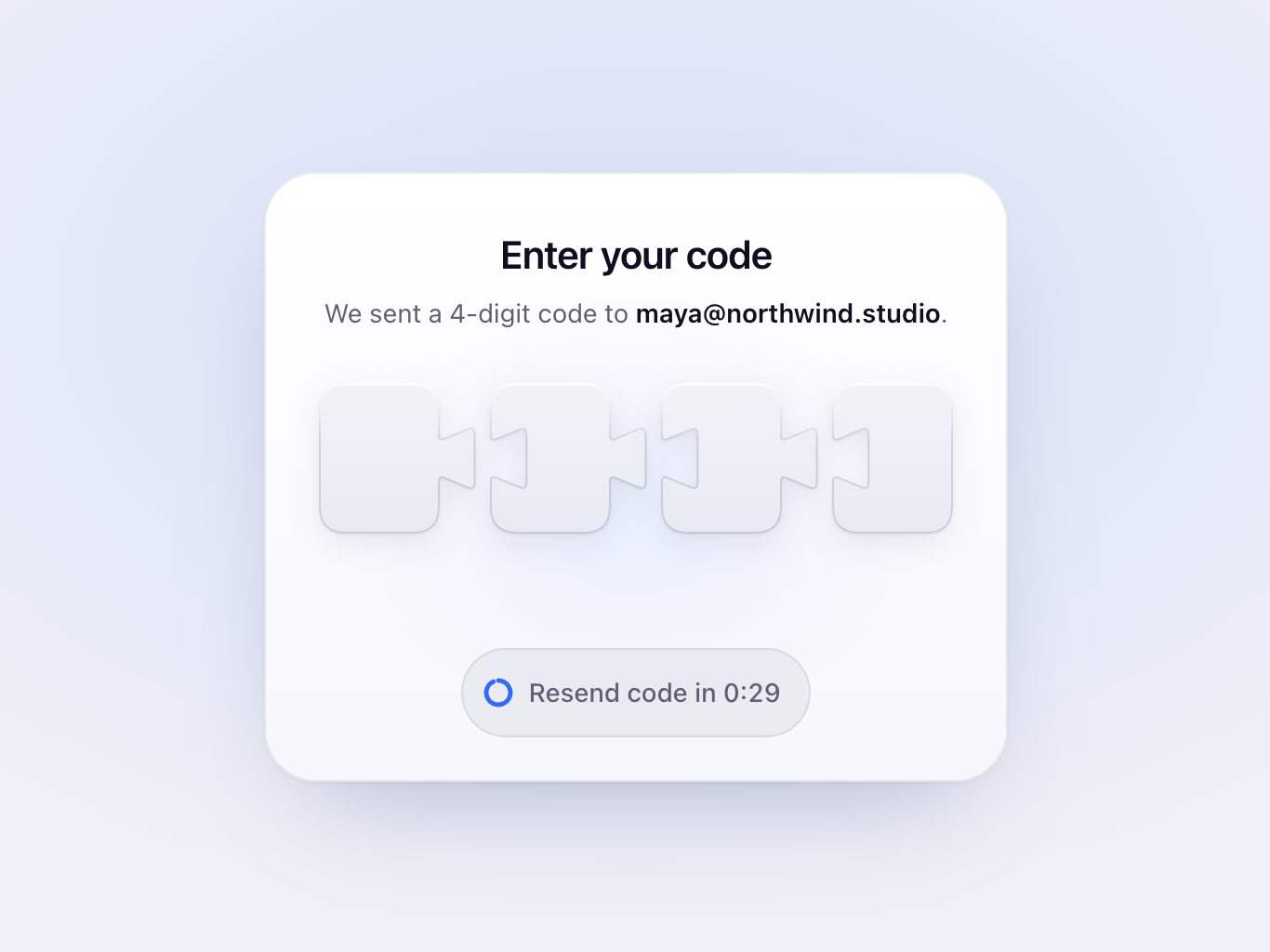
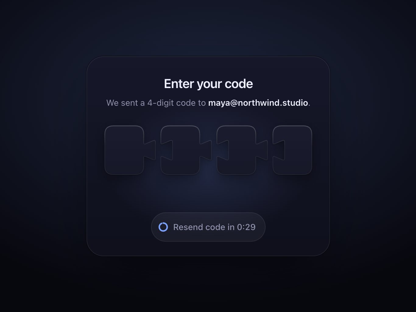
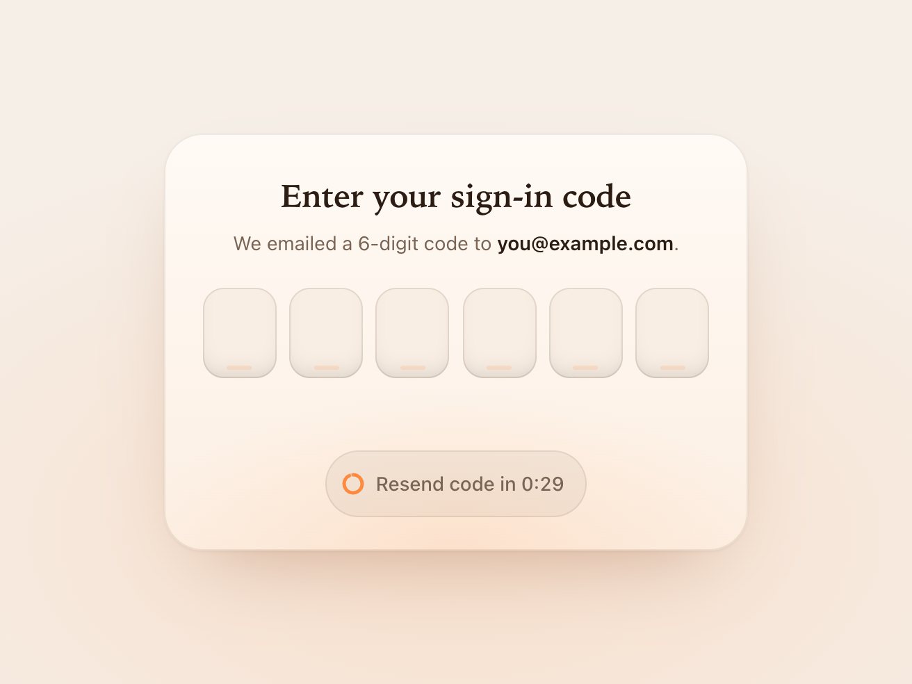
A one-time code field of puzzle pieces that slide together and lock into a check
11 KB0 depsForms
index.html
<!-- a coal per slot; the
check has no d, js
fits it to the row;
sparks spawn in fx --><span class="ember-slot" …><span class="ember-wick"></span></span>
…
<svg class="ember-mark" …><path class="ember-check"/><span class="ember-fx" …>
ember.css
/* two copies of the digit:
   a blurred one behind it
   carries the heat */
.ember-num, .ember-heat {
  grid-area: 1 / 1;
…
.ember-heat {
  color: var(--ember-flame);
  filter: blur(7px);
  opacity: .3; …
ember.js
// one eased k draws the// stroke and puts the spark// at its tip, via along(k)const k = easeInOut(
Math.min(1, (now - t0)
/ dur));
const [x, y] = along(k);
… p.style.strokeDashoffset
= String(1 - k);
… c.setAttribute('cx', x);
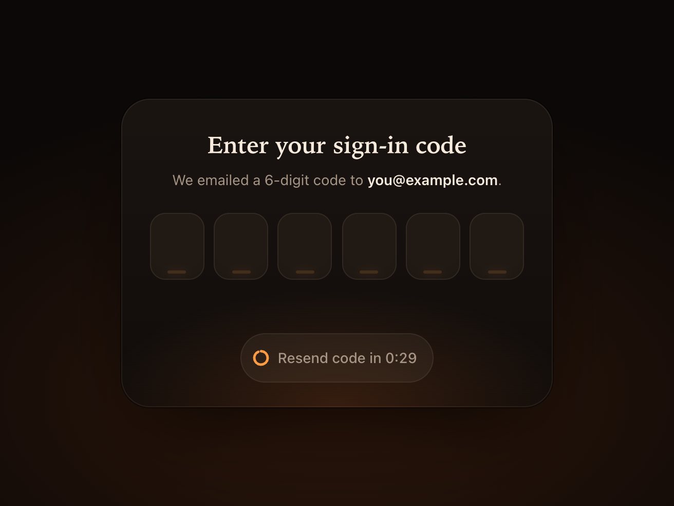
A one-time code field where each digit lights like an ember and a wrong code turns to ash
9.3 KB0 depsForms
index.html
<!-- one real input on top;
the tiles stay empty,
flap.js adds halves
and a hinged leaf --><div class="flap-row"><input class="flap-input" id="otp" type="text" …><span class="flap-tile" aria-hidden="true"></span>
…
flap.css
/* one leaf, two faces:
   the back waits folded
   behind the front */
.flap-tile {
  perspective: 480px; …
.flap-leaf-front,
.flap-leaf-back {
  backface-visibility:
    hidden; …
  transform:
    rotateX(180deg); }
flap.js
// new glyph: top half and// leaf back; the old one// stays on the leaf frontpaint(c.top, glyph, tone);
paint(c.back, glyph, tone);
// fall to -180, bounce 5°// back and settle: clackconst a = c.leaf.animate(
… 'rotateX(-180deg)',
offset: 0.86, …
'rotateX(-175deg)', …
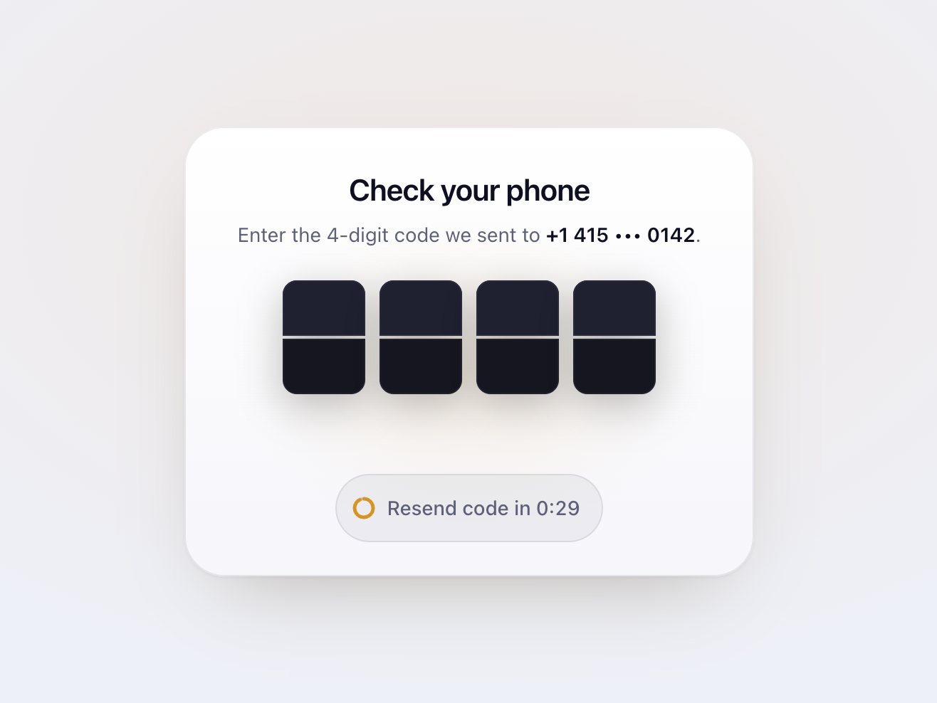
A split-flap code field that clacks each digit down and flips the board to DONE
7.8 KB0 depsForms
index.html
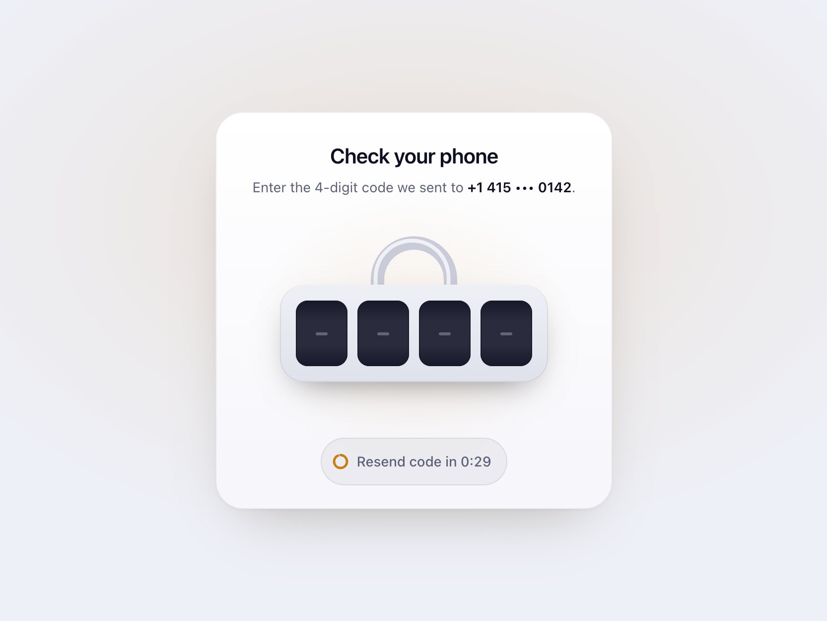
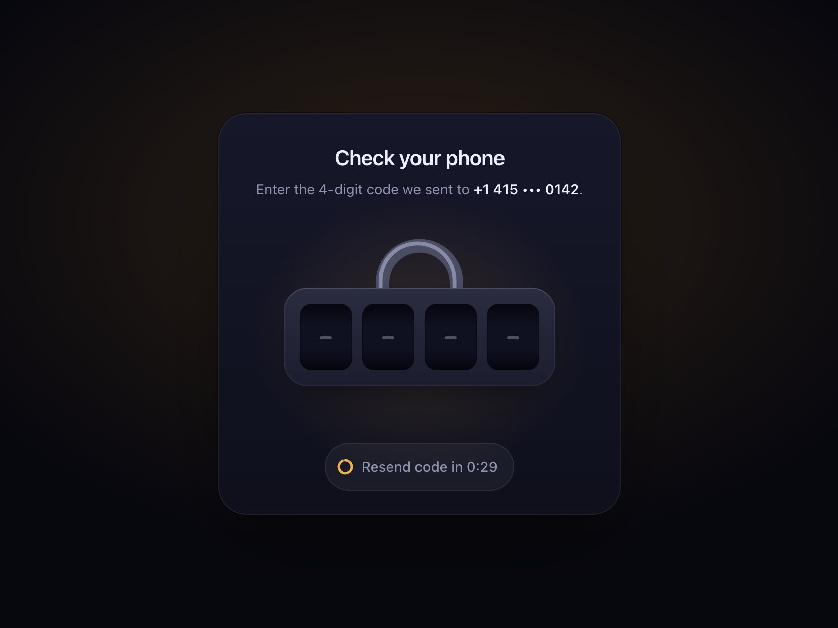
<!-- the shackle sits
outside the body, so
it lifts and swings --><svg class="hasp-shackle" …><div class="hasp-body"><!-- one real input over
all four wheels --><input class="hasp-input"
…><span class="hasp-wheel" aria-hidden="true">
hasp.css
/* the wheel clips a strip:
   --hasp-at picks the row,
   a spring rolls it in */
.hasp-strip {
  transform: translateY(
    calc(var(--hasp-at) *
    var(--hasp-wheel-h)
    * -1));
  transition: transform
    var(--hasp-roll, 420ms)
    var(--hasp-glide);
hasp.js
// the further it has to go,// the longer: 40ms a rowconst dist = Math.abs(
at - from);
strip.style.setProperty(
'--hasp-roll',
`${Math.min(640,
240 + dist * 40)}ms`);
// then just name the row
strip.style.setProperty(
'--hasp-at', at);